Colour is not just a simple aesthetic choice in graphic design; it’s an amazing and powerful communication tool. By understanding the impact of colour psychology on businesses in Adelaide, you can transform your branding, enhance your marketing efforts, and leave a lasting, positive impression. Recognising how colours shape perception is key to success, and that’s exactly where talented professional graphic designers in Adelaide can make a big difference.
What is Colour Psychology?
Colour psychology explores how colours affect emotions, perceptions, and behaviours. Each hue generates a unique response, consciously or subconsciously, shaping how people view a brand or product. For instance, red conveys energy and passion, while blue signifies trust and reliability. Graphic designers use this understanding to craft visual experiences that resonate with target audiences, making colour selection a vital component of effective design.
The Importance of Colour in Branding
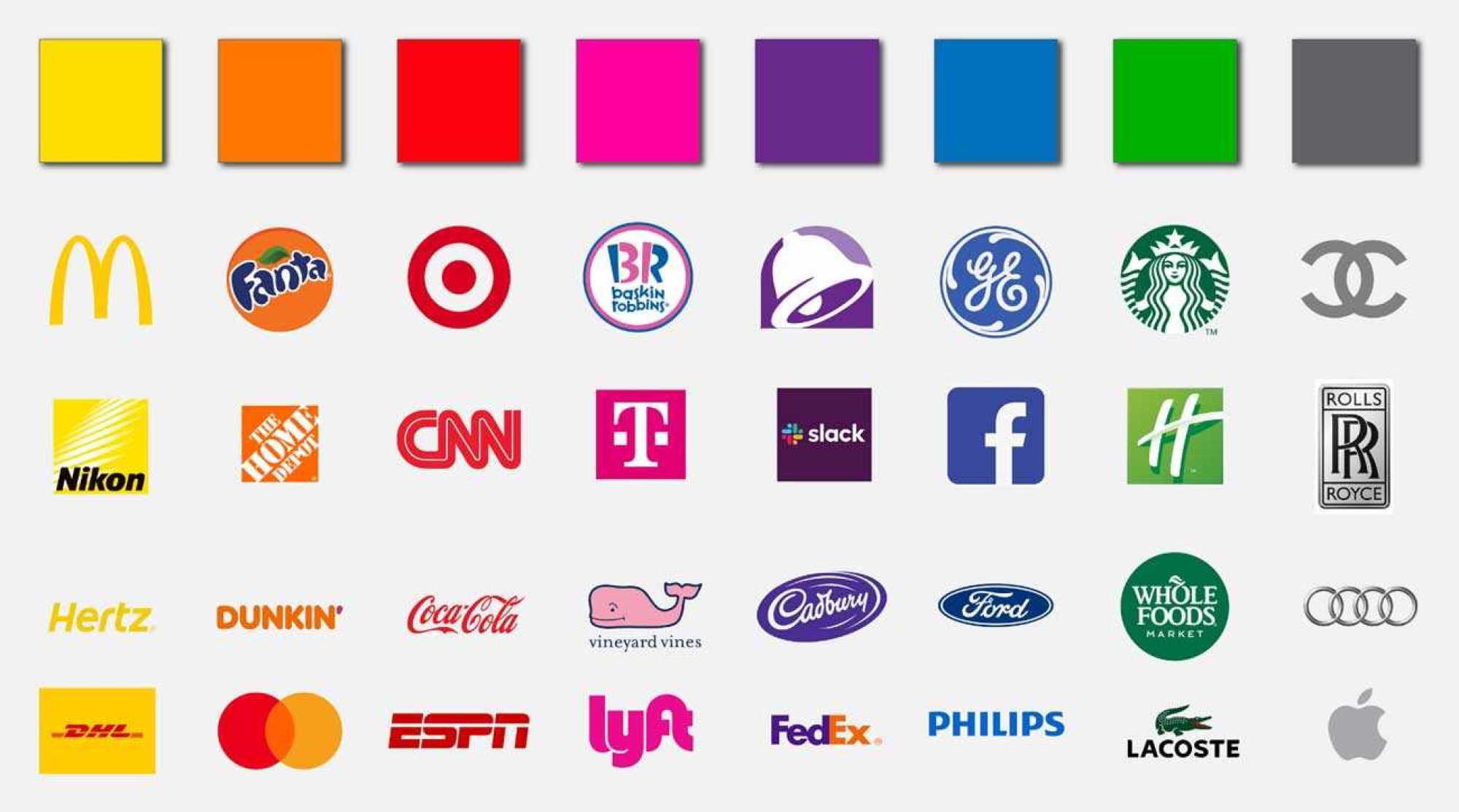
Branding is all about creating a memorable identity, and colour plays a central role in this process. Studies show that up to 90% of snap judgments about products can be based on colour alone. For businesses in Adelaide seeking to stand out in a competitive market, the right colour scheme can make or break a brand. Some quick examples of colour psychology out in the world include:
Red - Fast food chains like McDonald’s and KFC use red and yellow to evoke hunger and happiness. These colours stimulate the appetite and create a sense of urgency.
Blue - Financial institutions like PayPal and Visa use blue to convey trust and professionalism, encouraging customers to feel secure using their services.
Green - Companies like Whole Foods and You Foods use green to symbolise freshness and sustainability, reinforcing their commitment to health. Green is associated with health, sustainability, and growth.
A professional graphic designer understands how to use these associations to build a logo that aligns with your brand’s values and appeals to your audience.
Benefits of Using Colour Psychology in Graphic Design
Colour increases brand recognition by up to 80%. By consistently using specific colours across your marketing materials, you establish a visual identity that customers can easily recognise and remember. For example, think of Coca-Cola’s iconic red or Apple’s sleek white.
Colours evoke emotions, and businesses can use this to their advantage. Warm colours like yellow and orange express urgency, optimism and friendliness, while cool tones like blue and green express calmness, wellness and reliability. Quisk can help you choose a palette that aligns with your brand’s message and helps foster emotional connections with your audience.
Strategic colour use can influence consumer decisions. For instance, buttons in contrasting colours (like red on a white background) often see higher click-through rates. By guiding user behaviour through intentional colour choices, designers can help boost website engagement, sales, and overall conversions.
Colour transcends language barriers, making it an ideal tool for conveying complex ideas quickly. For example, green traffic lights signal “go” universally, while red indicates “stop.” Similarly, businesses can use colour cues to communicate brand values, product benefits, or calls to action instantly.
With so many businesses competing for your attention, standing out becomes more important than ever. Unique and thoughtfully chosen colour schemes can set your brand apart. As part of their concept stage, graphic designers will analyse competitors and develop a palette that separates your business.
How Graphic Designers in Adelaide Can Use Colour Psychology Effectively
Understand Your Target Audience
Before selecting colours, it’s essential to know your audience. Different demographics and cultures respond to colours in varying ways. For example, younger audiences might be drawn to vibrant and bold hues, while older generations may prefer more subdued and classic tones.
Align Colours with Your Brand Values
Consider what your business stands for and how you want to be perceived. If you’re an eco-friendly company, earthy greens and browns might be appropriate. For a tech startup, innovative blues and silvers could convey modernity.
Be Consistent Across Platforms
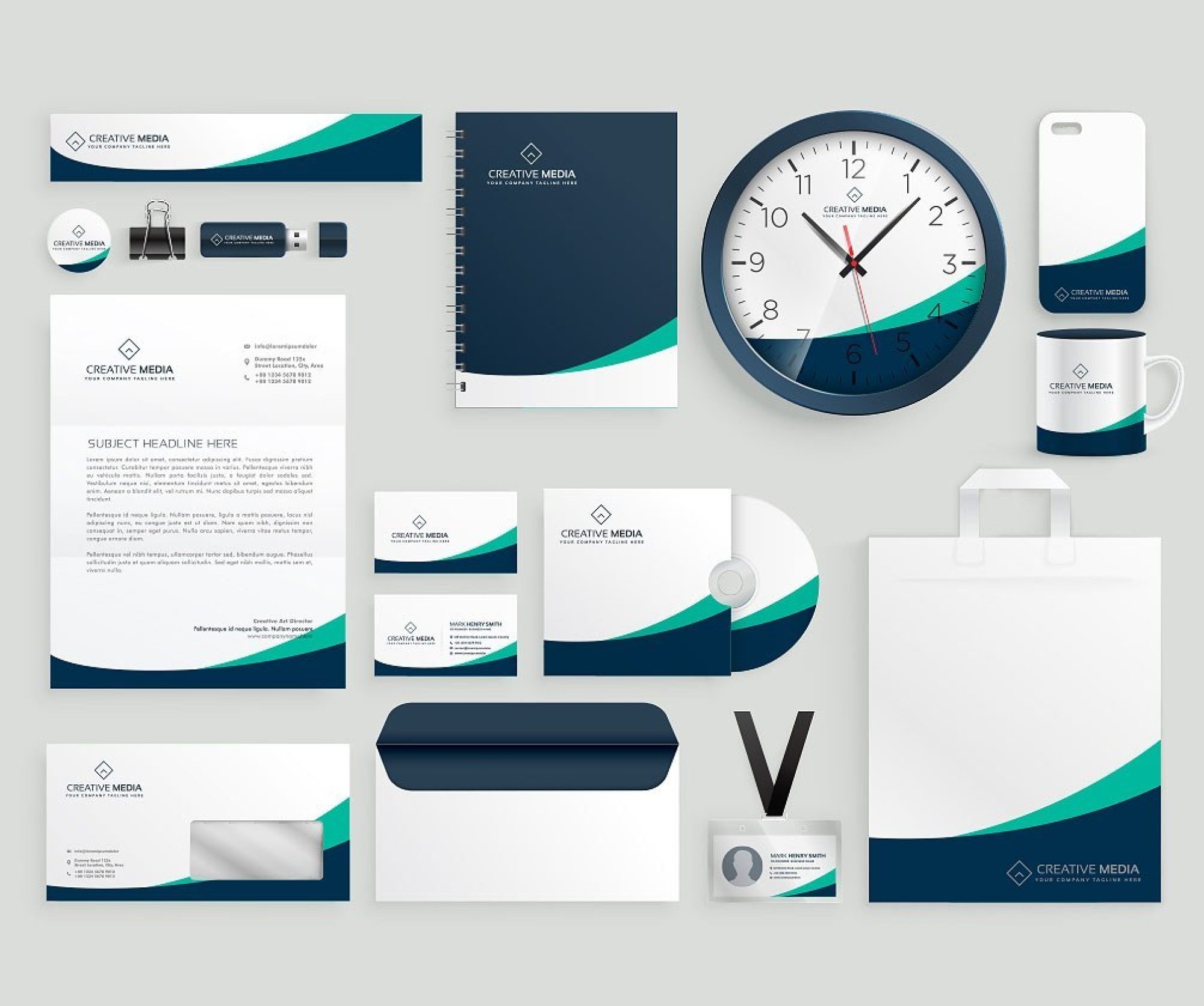
Consistency builds trust and recognition. Ensure your colour scheme is uniform across all branding materials, from your logo and website to your packaging and social media posts. As part of a comprehensive branding process, your graphic design agency should make sure your logo fits seamlessly into this cohesive visual identity.
Leverage Contrast for Readability
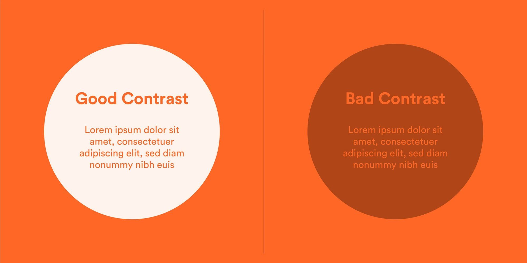
Colours should be appealing and functional. High contrast between text and background ensures readability, which is crucial for effective communication. For example, dark text on a light background or vice versa makes for an accessible design.
Choosing the Right Partner for Your Graphic Design Needs
Different industries require different design approaches, so spend time searching for a design partner who understands your industry. A retail business might need bold, vibrant colours to grab attention, while a healthcare provider might benefit from calming and trustworthy tones. When choosing a graphic design agency, make sure they have experience working with businesses in your sector or can demonstrate versatility in their design solutions.
For example, if you’re in Adelaide’s hospitality or tourism industry, you might need designs that reflect the region’s rich culture and natural beauty. A graphic design agency in Adelaide who understands these nuances will ensure your visuals connect deeply with your audience.
Effective graphic design is a collaborative process, and the best graphic designers in Adelaide will take the time to understand your business goals, target audience, and brand personality. They’ll listen to your input while offering creative solutions that bring your vision to life. When meeting with potential designers or agencies, ask about their design process. Look for a partner who involves you in key decisions and is open to feedback to ensure the final design meets your expectations.
Remember that your graphic design needs will evolve as your business grows. Finding a design partner who can adapt to your changing requirements ensures consistent branding over time. Whether your business is launching a new product, entering a new market, or refreshing its brand, a trusted graphic design agency like Quisk can guide you through each stage.
Colour Psychology as a Strategic Advantage
The power of colour psychology in graphic design is not just an art; it’s also a science. When done well, it can create memorable branding, help to deepen emotional connections and drive business success. Partnering with a trusted graphic design agency like Quisk will ensure your visual identity aligns perfectly with your goals.
Whether you're launching a new brand, refreshing your logo, or crafting a marketing campaign, don’t underestimate the importance of colour.

