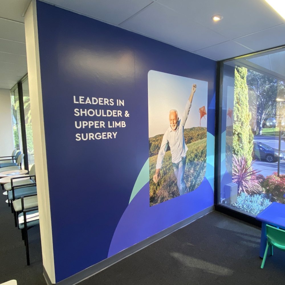
Mobility and strength conveyed via branding.
Adelaide Shoulder and Upper Limb Clinic entered the scene as
Orthopaedic specialists with prior history and prominence in the field,
keen to launch a new brand into the market.
Our Partnership
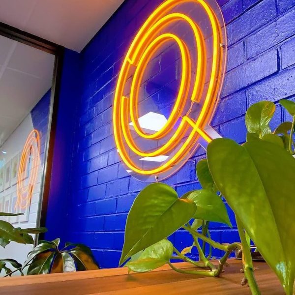
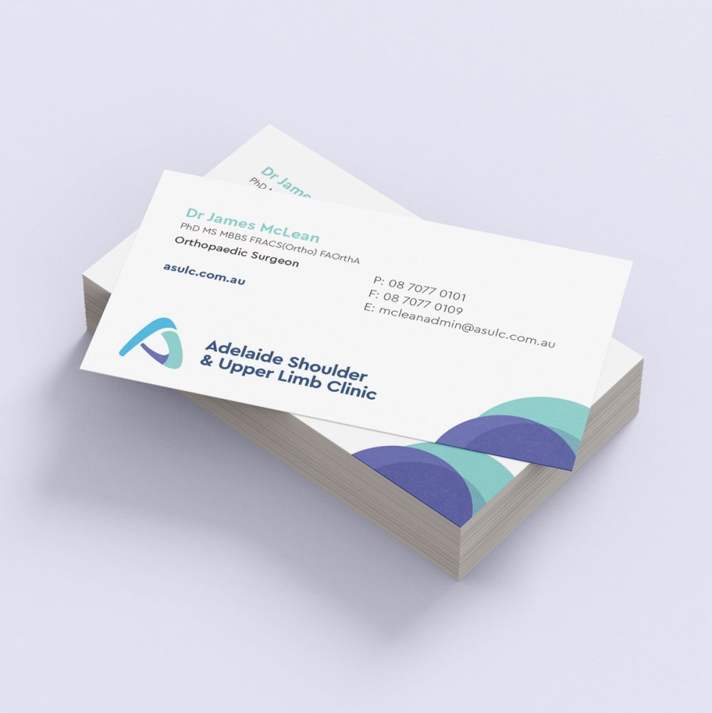
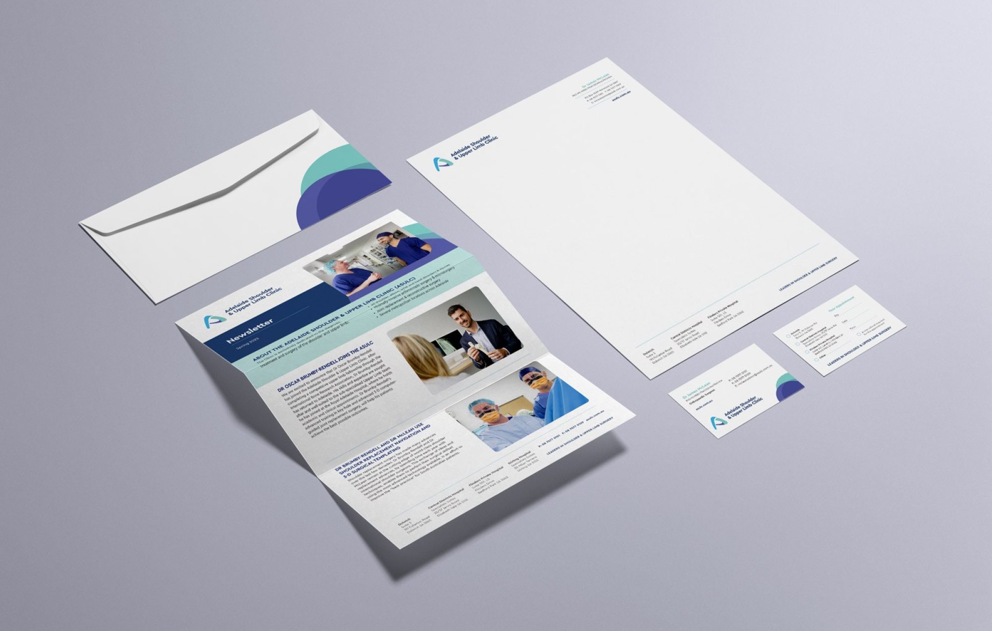
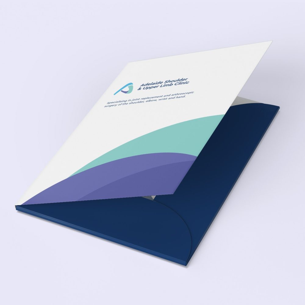
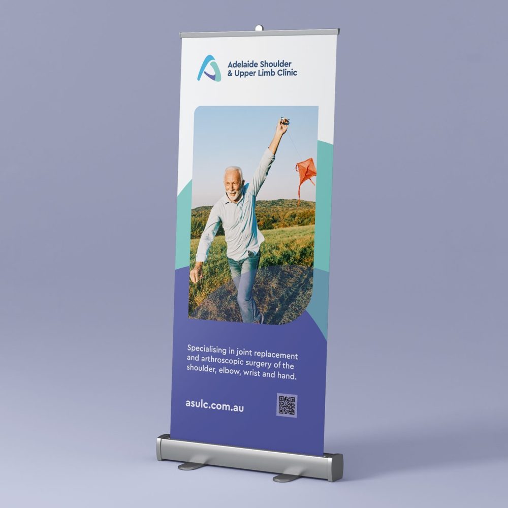
Our team found the logo's essence was clear from the outset and would be a dynamic representation of an arm. We blended the letter A, and a stylised forearm and bicep, giving life and movement to the logo. Once the logo was in place, it informed the creation of collateral, fact sheets, stationery, presentation folders, banners and location signage, reinforcing the clinic's visual identity.
The result was a suite of assets with a modern twist on the familiar medical industry aesthetics captured through a refined yet contemporary colour palette.
